When the Royal Bank of Scotland (RBS) recently held the launch party for its new £20 note, one of the designers responsible who should have been in attendance felt her time would be better spent giving a talk on calligraphy amid the alleyways behind Hunan Lu in Nanjing.
Susie Leiper was in Nanjing last weekend on a family visit. Both Leiper’s daughters live in China; Chloe in Shanghai, while Francesca is, fittingly, art columnist for The Nanjinger.
Yet, that did not stop the creative family from organising an impromptu workshop on the theme of “Chinese-Western Calligraphy”, held on 28 October in Solar Villa. The venue’s previous incarnation, Solar, watering hole and hangout spot for the then in-crowd, has recently been taken over by new ownership intent on turning it into a locale for more artistic events such as these.
After giving her talk on Western calligraphy to around 30 attendees, Leiper was countered by her Eastern equivalent, Huang Cen, of the Jiangsu Academy of Art, Jiangsu Artists Association. A Q&A followed, after which Leiper sat down with The Nanjinger to address the accusation that Chinese calligraphy is capable of being more potent than its Western counterpart.
“In Chinese, each word is a character. Each character is a design. So you have a huge bank of things you can pull on to design, whereas with 26 letters, you tend to end up with a string of regularity. But that is beginning to change now.”
On being commissioned as part of the team to design the new notes for the once-biggest-bank-in-the-world, Leiper recalled, “The design agency said to the bank, ‘Do you want the usual dude with a castle, or would you like something different? And the bank fortunately had somebody quite avant garde in there, so she said, ‘Maybe we’ll do something different’.
“So this design agency went off all over Scotland and asked the people of Scotland what they wanted on their bank notes, and it turned out what they wanted was the theme of nature.”
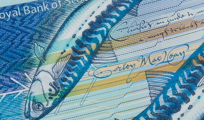
Leiper is of 27 designers to see their work on the new RBS currency; the latest five, ten and now £20 polymer bank notes. Leiper’s calligraphy debuted in 2016 on the then-new-£5 note, which features illustrations of Scottish poet Nan Shepherd, and was also the first part of the new series of, as a result of the aforementioned poll, “Fabric of Nature”-themed notes.
For the fans of typography, Leiper’s calligraphy on the new notes is written in 16th Century Scottish Secretary hand. “The trouble with [it], is it’s very difficult to read, even for me. So I had to look at old documents and work out, that’s an ‘e’, that’s a ‘d’. I mean it was really hard, and then try to write that with a flow…”
One of Britain’s leading calligraphers, Leiper is known both for her traditional skills in writing with quills on vellum and for her innovative use of the Chinese brush as a writing tool. Leiper’s formative years as a calligrapher were spent in Hong Kong, where she developed her passion for Chinese art and language. Calligraphy, painting, poetry; the three arts most treasured by the Chinese. Leiper aspires to marry western calligraphy, painting and poetry with the spontaneity and harmony of a Chinese master.
The Scotsman newspaper has described Leiper’s work as, “Western script with the skill of an oriental calligrapher. Text is combined with painting, drawing and sculpture, too”.


