Whether you’re an artist working on a painting, or a songwriter trying to create the perfect album cover, or a popular local magazine using it as the theme of one of their monthly issues, colour lies near the centre of our world.
Rihanna’s 2017 album cover, “ANTI”, uses a striking red with a golden-coloured crown, depicted on a white canvas with a black blotch of a balloon, which is almost coloured perfectly to contracts with the rest of the colour choices in the image.
Kendrick Lamar’s 2015, “To Pimp a Butterfly”, uses a timeless black and grey, representing that the grim issues expressed through his music have always been with us, and will not be going away any time soon.
Paramore’s, “After Laughter”, chooses a handful of bright and jolly pinks, purples, blues and yellows; ironically contrasting the melancholic messages hidden in the album’s lyrics. Toning them down also creates an almost artificial feel to the image, again mocking the fake joyfulness of the cover as opposed to the lyrical content.
I should also like to share the album cover of James Blake’s, “The Colour in Anything”. Being painted out, the use of dark green with grey and blue creates a sense of withering; it’s a gloomy atmosphere that prepares audiences for the somber journey they will undertake through the music therein.
We too, are made of colours, with them commonly used to represent our moods. Blue may be the universally-agreed-upon colour of depression, but with pigments of it rarely existing in nature, blue has also become rare and luxurious throughout the history of its use.
Many artists have used this quality of blue in paintings to highlight a sense of royalty, especially as to different wardrobes. Famously, Vermeer’s, “Girl with a Pearl Earring”, uses a magnificent blue on the subject’s turban, creating an illusion of richness. It is this sense of grandeur we associate with the colour blue that gives it such an overwhelming edge in every “favourite colour” study ever conducted.
Moving adjacent on the chromatic wheel, we come across an interesting choice. “My favourite colour is lilac”, Says Gilderoy Lockhart in the Harry Potter series. Perhaps you don’t like Lockhart as a character, perhaps you don’t like Harry Potter as a series, perhaps you don’t even like reading; whatever the case, it does not take away from the fact that lilac is a fun colour to explore.
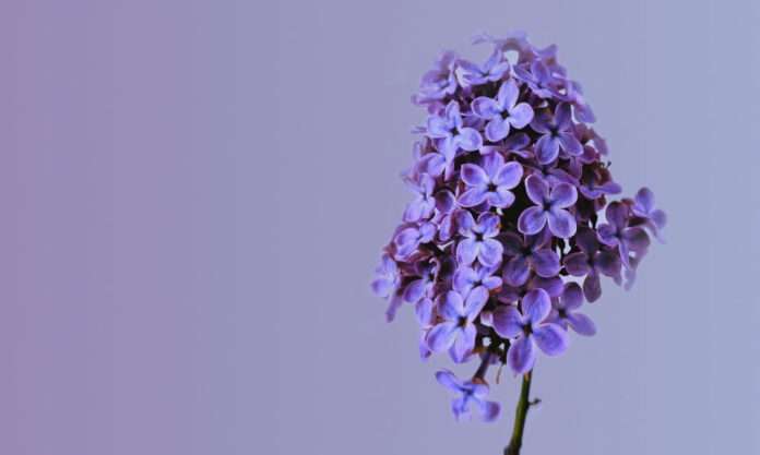
Being constantly overshadowed by its more popular counterparts in purple and pink, many may not even be familiar with the appearance of the colour. Named after the flower of the same colour, lilac may very well be known in its royal, serene and calm state.
It does not attract too much attention, yet is naturally beautiful, and seems to have everything under control.
It is perhaps due to this facet of lilac that the colour makes for such a popular choice among children with autism and ADHD. A bedroom painted lilac creates a sense of safety and promotes a feeling of love. And what possible better use for a colour could there be?

