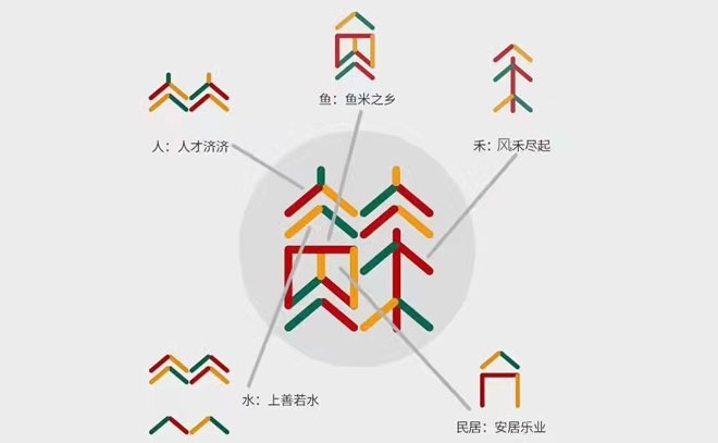
The first Jiangsu Development Summit, which had been organised by the Jiangsu Provincial Committee, has come and gone. Alert Nanjingers may have noticed the summit was fairly well publicised about town, by use of a logo; quite a distinguishable, warm and interesting one at that.
However, without a native speaker’s understanding of the intricacies of the Chinese language, it is often very difficult for foreigners to come to any kind of appreciation for the work that goes into designing some of these, the country’s most recognisable logos.
Therefore, and understandably, not many China expats will understand the build up of the logo and how it was created. For those in Nanjing interested, herein a simple explanation to help understand a logo that is being used to represent the place in which they live.
If one were to pull the Jiangsu Development Summit logo apart, five separate parts appear, that all help to form the logo, working in harmony and representing various aspects of what make Jiangsu unique:
人:人才济济 (Réncái jǐ jì) – “Talent Abundance”
Signifying the vast amount of talent coming out of Jiangsu at the moment from a variety of different industry.
鱼:鱼米之乡 (Yúmǐzhīxiāng) – “Plot of Plenty”
This signifies great wealth that Jiangsu has gained and kept over the recent past and how rich the land still is.
禾:风禾尽起 (Fēng hé jǐn qǐ) – “Wind Prioritising Action”
Signifying government commitment to small businesses.
民居:安居乐业 (Ānjūlèyè) – “Residential Harmony”
This highlights safety and harmony in Jiangsu.
水:上善若水 (Shàngshànruòshuǐ) – “Land of Tranquil Fluidity”
And this demonstrates how proximity to the Yangtze River has aided in bringing peace and tranquility to the people.
So now you know. Consider yourself suitably developed as a result of the Summit!


