Most of us see it every day. Maybe several times a day. Fluttering high over government buildings, large-scale institutions, tourist spots, the list goes on. The red and yellow is also nigh-on inescapable around each National Day. But what is perhaps now the world’s most-famous chromatic combo did not start life like this.
And if one particular great leader had held sway, there could have been considerably more yellow in the Chinese flag than there is today.
With the birth of the new nation in 1949, so too did the hunt for the National Flag of the People’s Republic of China begin. In response to the soliciting of designs, entries poured in by people from all walks of life, quite a few even from abroad. By 20 August, the National Flag and Emblem Selection Committee had received a total of 2,992 national flag designs (some say it was 3,012).
While many featured blue, yellow or white, they all had one thing in common; a big red background.
But in the process of whittling down the entries to a group of finalists, so too were the criteria for the flag laid down.
It should contain Chinese characteristics, imply authority, be rectangular in the ratio of 3:2, prioritise solemnity and simplicity, and last but decidedly not least, be red. You bet.
But not everyone could agree on the red itself. Initially proposed to be a much-darker shade; almost a crimson; it was China’s first Premier, Zhou Enlai, who broke the deadlock and said a brighter red was the way to go.
For quite some time, it appeared the new China’s flag would be based on a design preferred by Mao Zedeng himself.
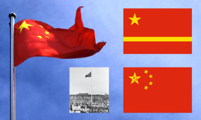
While the giant star was common to the 38 entries selected as finalists, Mao’s choice was for a version with a horizontal yellow bar across the top of the design’s lower third.
With that supposedly representing the Yellow River, Mao was supported by others in his preference. But not everyone agreed; others felt the horizontal bar was in effect splitting the country. It was a powerful argument.
Yellow, however, was not up for discussion. For yellow represented the light of the Communist Party illuminating a revolutionary red earth.
The Flag that almost Never was
Among the designs submitted but not shortlisted was one by an alumni of our very own Nanjing University, then the National Central University. Hailing from Zhejiang Province, Zeng Liansong had been working with the Shanghai Modern Economic News Agency when the call for entries was announced. He then set to work.
While his entry initially failed to make the cut, it had caught the eye of Selection-Committee member and renowned playwright, Tian Han. Out of the 16 members of the Committee, it was Tian who managed to get Zeng’s design back on the list, as finalist #32.
On the evening of 23 September that year, finalist #32 was recommended to the Premier. Satisfied, Zhou got Mao on board, who went before Zhongnanhai to hold a symposium in which he explained his reasons for supporting it, subsequently achieving a consensus among the delegates.
They were taken with the red and yellow for sure, but also the symbolism therein; the large star for the Communist Party and the smaller stars representing the four main societal groups in China. Only one change had been made; Zeng’s submission had included a hammer and sickle within the main star. It was taken out for fear of being overtly Russian.
Winning the day were those starry metaphors in Zeng’s design, netting him a commemorative magazine of the Chinese People’s Political Consultative Conference, worth ¥5 million*. Not a bad little earner for a dash of red, a daub of yellow and a smattering of symbolism.
* CPPCC magazine worth about ¥500 today.


